Showing posts with label TV Challenge. Show all posts

Elemental Challenge: The Air Goddess Brings nothing but goodness and light

I know I could regret sharing this, but ever since I was in my early twenties,  I've had this fantasy that in some alternate universe, I  am part of a pop supergroup phenomenon called "Elementals," with each member representing a different element.  Water is a sexy black girl, Earth is a buzz-cut skater, Air is a blonde soprano, Fire is a Latino guy, and I am Lightning.  The whole world loves us and every song we sing is an instant hit.  Everybody asks each other, "Which Element are you?" just like people used to ask "Who's your favorite Spice Girl?"

So, therefore, this challenge was cool and dear to my brain.

This week, the challenge was to design a garment inspired by one of the elements.  No other direction was given, so a lot of the designers went intentionally FAR out of the box and created colorless dresses out of black and grey.... Why?

For those that have been following me for a while, you know that I already have made a Sea Goddess dress, so I thought it necessary to create am Air Goddess dress that actually was flowy and colorful and...airy!  

No offense to Trina and my other girls, but this instance a live, flexible walking runway model would showcase this garment a LOT better!  I just wish that I could take a picture right of how the fabric moves in the wind with arms outstretched and huge strides being taken.  But, that will have to wait, so this set and the will just have to work for now.


I set up three sets of fans to blow on Trina to show flowiness, but since I prefer to use my camera with spotlights rather than with a flash, it was hard to take a picture without the moving parts of the dress becoming blurry, so I took a video to show how it blows in the wind.  The clip only lasts a few seconds (and I know it looks "squished", it's because I rotated the screen in an editing program, and that's just the way it is!).


When I thought of the kind of costumes my Supergroup would wear, this is definitely one that my Air girl would wear in some romantic ballad number with the wind blowing up from stage fans as the crowd hold up lighters and cries because we are all so beautiful.


Okay, now that I've shared this with the world, let the teasing begin...

Hardware store challenge: bidi, bidi, bidi...

This was fun.  This week, the challenge was to use items found in a hardware store to make an outfit.  I wasn't too sure about this one because on the show, they had a budget of $150 to get their materials.  But you  know what?  I went to the hardware and automotive section of two different dollar stores and made this entire outfit from materials that cost altogether Nine Dollars.


Before I get to what the dress is made from (I know you are all dying to know, so now I can be mean and make you wait), I want to mention that I've been waiting for an excuse to make a Twiki outfit for some time now.  I sure am glad I waited until this challenge came up, because I like the way it turned out.  I always liked the Twiki character, although I did restrain myself from going around the house saying, "Bidi Bidi Bidi" as a kid, at least not while anyone was watching.  Maybe I liked him because we were both short.  Maybe I envied his bowl-cut haircut, a style that I was never allowed to have.


Okay, are you ready?  I know this outfit looks like it was made from glittery black fabric and burgundy satin, but it is actually made from silver car windshield shades, black rubber shelf lining, and red cleaning rags from the automotive department!  The earring accessories are mini hex wrench sets (2 for $1!) suspended on keyrings!

(I considered making an accessory representing Dr. Theopolis, which Twiki wore around his neck, but decided it would be too distracting and just hinted at his presence by the rounded closure at the front of the jacket)

I originally thought to make the whole thing out of the silver shades at the risk of a "Tin Man" callout, but when I happened to overlap the shelf liner on top of the shade, I noticed it gave off this cool glitter look!  Amazing!  The added bonus was the shades are backed with a thin sheet of foam.  This made it absolutely perfect for creating those insane shoulders/sleeves without necessitating shoulder pads or stuffing of any kind.  The sleeves stand up all by themselves.

Not to say the whole thing was easy and I will be quick to use material like this in the future for "stand up" features.  My machine hated these shades.  Well, I should say, the presser foot hated it.  The back was rubbery and therefore would not glide under the presser foot at all.  I had to use machine oil (applied with a Q-Tip) to lubricate the top of the material for every single seam.  But, hey, she's supposed to be a robot, so I guess it's appropriate!

Cover Girl: Green Acres of Floral Fabulousness


So the challenge this week was to create a look for a magazine cover to be modelled by Heidi.  The scary Editor in Chief (well, she was very intimidating, but for some reason, I wanted to be her friend...) of Maire Claire magazine gave some VERY useful advice for creating a cover look.  No black because you want a bright color to stand out.  Remember that there are going to be words printed over the image, so busy prints and too many details would make it hard to read the copy.  Since the image will most likely be from the thigh up or closer, the interesting detail work should be on the upper part of the body.  And most of all, you want the outfit to really catch the eye of someone walking by a newsstand and make them want to buy the magazine within 2 seconds.

So with this outfit, I was inspired by a Springtime basket of flowers and "Green Acres."  Eva Gabor's character was a city girl forced to live on a farm.  On the show, she tried to dress like she was still in the city, but I think that it would be a cool concept to see how she would try to still dress "upper class" while trying to fit in with the rest of the "country" townsfolk (all the while knowing inside that she was still better than them).


I know that orange is a "different" choice for Spring, with it being usually more of a Autumn color, but it's so bright and when paired with the floral print of the "flowers" on top, I think it's very Spring.  I put into practice my new theory of, "make a simple, well-made garment with one dramatic point of interest and one minor one" into play here with a no-frills pencil skirt and short-sleeved jacket.  Of course, the focal point it the collar with the fabric flowers spilling out, and the minor detail being the asymetrical button closure and it's ready for our cover girl!

I could have made the peplum a little more angled to reflect the shape of the collar, but all in all, I'm quite happy with this outfit.  Although it's tough to make things..."simple" after convincing myself that simple=potentially boring, I was very happy to find that taking the simpler route really saved a huge amount of time and makes the focal point detail stand out that much more!  Who woulda thunk it!?

Buy the magazine already!

Challenge Time: Canned Fashion? Stays Fresh Forever!

This week, the designers had to create a one-day dress for a Gala event for heart disease sponsored by Campbell's Soup.  The models were "real women," and the color red had to be predominant in the design.  Also, the Campbell's soup branding had to be present somewhere on the garment.

So, first of all, let me bravely say that I thought that all the designs on the show this week looked JENKY.  I'm not saying that all the things that I do are all perfect, but this episode, I think that the designers got freaked out by the time constraint or the fact that the women wearing the dresses were not model-sized, because even the winning design looked thrown together and unfinished.

So here is my take on the concept.  It is probably easy to see that I made a dress with the color scheme of a Campbell's Soup can.  Of course, on the can, the white is on the bottom and the red on the top, but a red blouse with a white dress would be INSANE!  And not in a good way!  So I flipped it to make it a little more pleasing to the eye.  You can also see that the ruffled circle tucked behind the black belt represents the medal in the middle of the can label.

It's not apparent in the pictures because Trina isn't actively walking (she only does that when I'm not in the house).  But the skirt flares out in a heart-shaped pattern at the bottom.  It's just a little hidden touch that sounds cool when I describe the outfit.

Although obviously I used one of my girls to model this dress rather than a "real woman," I think that this type of design would work on a large variety of body shapes.  A big woman could wear this style, as well as a short woman (I would just shape the skirt a little different to raise the point that it flares out) and I also think that most women would appreciate the fact that there are sleeves on the dress.

You know, I tend to think that I empathize what women find enjoyable or uncomfortable about their clothing, but the one thing that I don't yet understand is thoughts on sleeveless clothing.  For men, sleeveless clothing is limited to desperately hot days, unless you have REALLY good looking arms, in which case you have earned the right to show off, but still, it pretty much has to be a warm day, and you can't be sleeveless if you go to any place were you have to look "dressed."

For women, bare arms are the norm when "dressing up," but in all the studies in fashion history, there really doesn't seem to be a reason for this.  I would accept it's maybe because it is considered sexy due to the fact the woman seems partially undressed, I suppose.  But there are a lot of women out there that just don't BELONG in dresses that show their arms, whether they be too flabby or too bony or many other reasons.

So I ask the women out there, are you always, if ever, comfortable wearing clothes that show your bare arms?  I'm just curious!

Challenge 2 - Potato Sack Party Party

Oh, my.  I've not had ANY time to make anything this week!  This challenge was technically a One Day challenge, but unfortunately, I only had time to work on this dress in three-hour spurts, and it unfortunately shows!

Well, disclaimer aside, for those of you who don't know, this week, the designers were given the task to make cocktail party outfits out of burlap sacks.  It was very interesting that I did indeed have burlap in my stash of fabrics!  I got it as part of a lot that I bought for very cheap at a garage sale.  It was already this red color, I didn't dye it.  I just KNEW this burlap would come in handy some day, and it did!

First of all, I wanted to make sure that I used the stiffness of burlap to my advantage and not fight against its nature and pretend it was a giving fabric.  That is why I knew I wanted to make something that defied gravity.  Those of you that know me well are probably aware that I often curse gravity, especially when it makes things fall just to torment me.  So I was more than willing to make something that said, "HA!  Take That, gravity!"  I think that the collar is an exciting feat of engineering.  Not everyone can figure out how to make a big stand-up collar that, much less one that is part of the bodice (not attached as a separate piece).

But what was I was most excited about when designing this dress is something that you may not have noticed yet.  On one side, it's a bolero jacket, but on the other side, Oh!  It's part of the dress!  It's only a jacket on ONE SIDE!  That's INSANE!!! No one has ever done that before and it's AWESOME!  Forget that this particular dress isn't all that wonderful, if I did an idea like this half jacket again with a real fabric with a different design for the rest of the dress (most likely something simpler without the huge stand-up collar, but with a longer, more elegant skirt), I could have a serious genius moment!  Do It!

So, yeah, I was pretty frustrated making this thing.  The outcome is "okay".  Definitely not something that I am going feel the need to keep in the already-full closet.  But it's also a reminder that when it comes to the TV challenges, I must follow the formula.  As this is only the second episode, I only needed to make something pleasant and well-made to stay in the game (note many of the safe designers as well as the challenge winner made either simple fitted sleeveless shift dresses or plain bodices with dirndl skirts).  Pushing too hard and getting too artsy puts you in danger of being placed into the "strange/misunderstood" position, and those are the ones that get sent away early in the game.  Only get bold and edgy when the judges start to complain that the designs are boring.

Oh, by the way, though.  Raine was very happy that she got to go to the industry party this time around, as she lost out last season to Leonora.  See how happy she is?  Well, she's not smiling, but that's only because burlap is itchy...

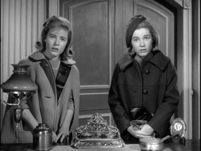
The Patty Duke Show: The Challenges Begin Again, The Kitty Returns

The theme of this premiere episode was to make a garment that shows "who you are as a designer."  Once again, I understood the directions better than most (haha, I'm so very humble, I know!) and designed a dress that actually means something to me.

The Patty Duke Show is one of my all time favorite vintage TV shows.  Not only was it cutting edge for it's time (the split screen effect they used to show Patty playing two different characters on screen at the same time was nothing short of magical), but the storyline and characters and all-over fun kept the show interesting.

I remember one episode in particular that has stayed with me.  Short story is: Cathy made a cute little jumper dress with a kitty on the front.  All the girls at school wanted one after they saw it, and Cathy, wanting to please people, started making dresses for everybody and soon realized that not only was she overwhelmed and underpaid, but no one understood how much work went into making the dresses.


So here's my psychology lesson, but bear with me, it has a promising ending.  Cathy's Kitty dress dilemma somewhat parallels my ongoing journey as a designer/stitcher (which is what you call a male seamstress).  I know the most people don't understand that clothing isn't something that you effortlessly "whip up."  And listen, I still am not above paying my dues.  I've hemmed pants, sewn pillow cases, altered curtains, upholstered cushions, etc.  So, to me, this kitty dress represents my ongoing desire for people to regard me as a good designer and clothing maker, and not just someone who simply knows how to use a sewing machine.

But you know something that I realized?  People are starting to respect me as a designer more and more, which makes me SO happy!  For example, this year I made some garments for friends and family as gifts, and for one, I offered to go with his idea for a canvas bag to hold a floormat, and he told me that he would rather like me to make him a pair of pants.  I don't think he has any idea how much that meant to me!  To know that people have confidence that I will produce good clothing makes me gain twice as much confidence in my own work!  So, thank you, Easter Bunny!


So, what can I say about this particular dress as it comes to the particular challenge for which it was intended?  Backstory aside, this dress says that as a designer, I am a little retro, a little urban, a little punk, a little whimsical.  And most importantly, I want to say that my style is super-cute and well-made and super well-fitted!

Would this design win me the challenge?  Maybe, maybe not.  They would probably say that it is a little "costumey side," although I can totally see a girl going to a underground European dance club wearing this.  If I made this dress again, I would not add the buttons on the collar and I wouldn't angle of the bodice/skirt connection like that.  Straight across would probably be less "interesting" but more flattering, after all.  The dress ain't bad, though.  It would keep me in and that is what is important in the first rounds!


In closing, this dress's theme may look familiar to my long time fans as I have made a slightly less-edgy version of the kitty jumper (OMG, two years ago!) for the Kidney.  Compare and contrast.

Jetson Collection II: Jane's Night Out

This week's challenge involved using a divorcee's wedding dress to re-create a new look for her, basically a "first date after the divorce" outfit.

I was not about to go out and buy a wedding dress just to take it apart, (even at thrift stores, wedding dresses are not cheap!) but I remembered a friend gave me her old bridesmaid's dresses, one of which I have already used, and lo and behold, one of them was purple, just like Jane Jetson's staple outfit, and the outer fabric was futuristic-looking semi-transparent shiny crepe! Score! Thanks, Sara!


I knew that I had to do a nice dress for a lady "of a certain age" for Jane, while still making it known that she still has a very nice body.


After much mental deliberation, I decided on a criss-cross halter to echo her original triangle-shaped collar, and made use of the old dress's liner fabric to create the double-layered skirt that cartoon Jane's outfit had. Sorry, I decided against the purple tights, though. I know you're disappointed. Take this time to cry and I'll be here when you come back.


Here's the make-it-work time. I hated this dress when I first finished sewing it. You can see in the picture to the right, the original placement of the the skirt. Boring! It just hangs there and there's really nothing "designer" about it. The liner underneath looks like it was hemmed incorrectly rather than being intentionally longer than the outer skirt.

I started taking pictures anyway, resigning myself to the fact that I wouldn't have to worry about putting this one in my portfolio and at least it had only taken one day to make.


Then, in a fit of "No! I can't just let this be unimpressive!" I pulled up the sides and attached them asymmetrically to the waistband, and it created more fullness, more shine, and more interest! Sounds like a commercial for Pantene! Thank you, Easter Bunny!


Posted by Picasa

Jetsons Collection III - Rosie's Revenge

This week was a tough one for me. There are SO many reasons why this pop-star performace outfit was destined for phail, but let's start with the positives!


Conceptually, there was a lot about this outfit that stemmed from Rosie's maid outfit. The grey material of the jacket is obvious as a base inspired by Rosie's metal robot body. The ruffles at the collar and the cuffs are also meant to echo those in the cartoon version. The extra wide peplum looks like an apron. So those are the givens.

If you look closer, you can see that there are grommets/rivets placed in various places on her jacket, and the sleeves are meant to look like they are disconnected and being held on by buttons, just like Rosie's arms are being held on by the large red buttons above her biceps.

So on to my feelings about why this is not good? I start with the actual TV challenge. I do not care at all for Aggie. I am not inspired by Aggie. I would never care to make a garment for Aggie because I think she is rude. So with this outfit, I did not have in my head an outfit for Aggie, but for another pop tartlet that I like much better, Rhianna. She has a daring fashion sense and is not afraid to wear something with no pants.

But here's the thing. I LOVE Bob Mackie!!! He is my hero because has done a LOT of design for old TV shows, and SO respected in the fashion world. I want to be like him! So next week, I am dedicating myself to do a collection inspired by a famous show that he used to dress.


Disappointments with this most recent PR episode aside, and my lament with the grey fabric being more difficult and wrinkle prone that I would have liked, and the fact that I discovered too late the white material for the ruffly blouse had a mild case of mildew, the fault in this outfit lies with me in the end. I wanted to make an outfit that was over the top and stage-not street- wearable. And although this outfit is definitely not understated, it needs to be much more grand and awe-inspiring.

All a learning experience, though! Better to learn from mistakes so you know how to better your product next time.


Posted by Picasa

Little House Of Nellie, Now in INC!


This week's challenge was to design two outfits for the INC brand, which is exclusive to Macy's. INC is a line of clothing that I would describe as "young city professional with an edge."


This work was also supposed to be done all in blue, but I don't always have the luxury of going shopping with a $100 budget for each of these exercises, so I used what I had available, and I have been waiting for an opportunity to use these two fabrics for a while. They were good finds!


I chose "Little House on the Prairie" for this TV inspiration. Seems strange, doesn't it? Not really, though. I feel like the character of Nellie Oleson today would have grown up to want to be a bitchy business woman like her mother, but still want to dress in frilly, ruffly garments like she did as a spoiled child.

Ruffles ARE NOT used to hide flaws. They add visual interest, femeninity, and romanticism when used correctly, thank you very much. Chew on THAT, ruffle-haters!


This top is convertible, as you can see, and can be worn with or without the belt/sash. I like it both ways. Raine is excited to be holding a purse. That is the only way she is tolerating being a bleached blonde for a week.


Also, be sure to click on the pictures to see the larger view. There is a cool pattern on the pants that you can't see too well in the small pictures!


Posted by Picasa

Little House of Laura: The Country Girl Remembers The Easy Life


Everyone knows that Laura grew up to be Laura Ingalls Wilder, first a teacher and then a famous author, so as a grown-up, she would probably be dressing a little more professionally than this, but on the show (at least when Melissa Gilbert was still little and show was still good) she was labelled a "country girl" from the first time she met Nellie at school.


So I went with the country kitchy vibe and gave it a Behemian 70's translation. Bohemians are poor, and so was the Ingalls family.

Laura's child costumes all seemed to have similar features, whether they were her play clothes or her Sunday best: square cut front with a round collar, gathered dirndl skirt (a simple rectangle of fabric gathered into the waistline), and gathered/puffy sleeves.

I could go into the reasons why all these aspects were appropriate to the period and social class, but I'm sure it would bore you. Let's just say that it has something to do with the fact that Laura's mother made all the family clothing.


This is again for the INC challenge. This line is from Macy's and it also seems affordable (compared to expensive designer outfits). So this dress is very simple (HA! Read "Simple" when I made a similar dress a little over a year ago and it took three days! OMG! Same wig!) and actually photographs more fancy than it looks in person, which is fine with me!


Posted by Picasa