The theme of this premiere episode was to make a garment that shows "who you are as a designer." Once again, I understood the directions better than most (haha, I'm so very humble, I know!) and designed a dress that actually means something to me.
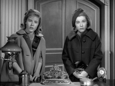
The Patty Duke Show is one of my
all time favorite vintage TV shows. Not only was it cutting edge for it's time (the
split screen effect they used to show Patty playing two different characters on screen at the same time was nothing short of magical), but the storyline and characters and all-over fun kept the show interesting.
I remember one episode in particular that has stayed with me. Short story is: Cathy made a cute little jumper dress with a kitty on the front. All the girls at school wanted one after they saw it, and Cathy, wanting to please people, started making dresses for everybody and soon realized that not only was she overwhelmed and underpaid, but no one understood how much work went into making the dresses.

So here's my psychology lesson, but bear with me, it has a promising ending. Cathy's Kitty dress dilemma somewhat parallels my ongoing journey as a designer/stitcher (which is what you call a male seamstress). I know the most people don't understand that clothing isn't something that you effortlessly "whip up." And listen, I still am not above paying my dues. I've hemmed pants, sewn pillow cases, altered curtains, upholstered cushions, etc. So, to me, this kitty dress represents my ongoing desire for people to regard me as a good designer and clothing maker, and not just someone who simply knows how to use a sewing machine.

But you know something that I realized? People
are starting to respect me as a designer more and more, which makes me SO happy! For example, this year I made some garments for friends and family as gifts, and for one, I offered to go with his idea for a canvas bag to hold a floormat, and he told me that he would rather like me to make him a pair of pants. I don't think he has any idea how much that meant to me! To know that people have confidence that I will produce good clothing makes me gain twice as much confidence in my own work! So, thank you, Easter Bunny!
So, what can I say about this particular dress as it comes to the particular challenge for which it was intended? Backstory aside, this dress says that as a designer, I am a little retro, a little urban, a little punk, a little whimsical. And most importantly, I want to say that my style is super-cute and well-made and super well-fitted!
Would this design win me the challenge? Maybe, maybe not. They would probably say that it is a little "costumey side," although I can totally see a girl going to a underground European dance club wearing this. If I made this dress again, I would not add the buttons on the collar and I wouldn't angle of the bodice/skirt connection like that. Straight across would probably be less "interesting" but more flattering, after all. The dress ain't bad, though. It would keep me in and that is what is important in the first rounds!
In closing, this dress's theme may look familiar to my long time fans as I have made a
slightly less-edgy version of the kitty jumper (OMG, two years ago!) for the Kidney. Compare and contrast.


 I wanted to make a dress quick quick quick. I have a record of making a lot of separate pieces. Even the gown that I did most recently was a two-piece, and wanted to challenge myself to do something speedy and easily constructed without being too simple-looking or boring.
 So sleeves and pants were out, and a halter neckline and a skirt was in. I can't say that this romper dress is Simple. I can't just put out a potato sack with a belt! But the whole thing, including designing, drafting, and mocking, took less than 12 hours, which is really fast even considering I also re-drafted and mocked the skirt after a first failed attempt.


 So with this outfit, I was inspired by a Springtime basket of flowers and "Green Acres." Eva Gabor's character was a city girl forced to live on a farm. On the show, she tried to dress like she was still in the city, but I think that it would be a cool concept to see how she would try to still dress "upper class" while trying to fit in with the rest of the "country" townsfolk (all the while knowing inside that she was still better than them).


 The theme of this premiere episode was to make a garment that shows "who you are as a designer." Once again, I understood the directions better than most (haha, I'm so very humble, I know!) and designed a dress that actually means something to me.

 But you know something that I realized? People are starting to respect me as a designer more and more, which makes me SO happy! For example, this year I made some garments for friends and family as gifts, and for one, I offered to go with his idea for a canvas bag to hold a floormat, and he told me that he would rather like me to make him a pair of pants. I don't think he has any idea how much that meant to me! To know that people have confidence that I will produce good clothing makes me gain twice as much confidence in my own work! So, thank you, Easter Bunny!


 I got a few comments from my last outfit that Samantha's shirt dress (or at least the print) looked Serena-appropriate. While I agree that Serena would like the wild print from that dress, she would never wear something that subdued. Serena thought of herself as a rock star, so I made this slightly-off-kilter combination for Serena (something Samantha would never wear) as inspired by her living room rock number, "I'll Blow You A Kiss In The Wind."
 I'm not sure WHY this scene still stands out in my mind after all these years. Maybe it was the awkwardness of the camera movements trying to do the 60's psychedelic rock video thing. Maybe it's that the song is memorable thanks to the "wi-i-iiiind" hook, but not necessarily that good. Maybe it's because I didn't fully appreciate Serena until I became an adult and realized she was fabulous (I used think she had an annoying voice and always wondered how someone wearing such an ugly wig and bad makeup was so mean).

 In the end, I really like the skirt. I think it's adorable. And as for the top, I like the way the collar turned out. I would definitely consider doing something like that again in an even bigger proportion on top of a dark cocktail dress. with a really full skirt.
 Look! It's a one-piece! I've been doing a lot of separates lately, so I wanted to make something less complicated (and less time consuming!) while still hopefully keeping it interesting and beautiful.

 There ARE, however, details that you may be able to see when you click on the pictures for larger views. I could not just present a completely plainly-made garment, otherwise, it would not be "designer." You can see on the front and back, there is an assymetical diagonal seam across the shoulder with a change of pattern direction from vertical to horizontal on the upper panel. It makes a little bit of a "sunburst" effect at the shoulder at the front.

 Lesson at the end of the day? With black material, you can get away with murder/mistakes all day long. The same goes with busy patterns as long as you keep it simple. And far those of you who think that prints make you look fat, no. Only big prints make you look fat. There, I said it!

 Mrs. Howell is ready for the cold island weather in her new green plaid coat over a simple belted lime green shift dress. Doesn't the fresh infusion of color make her look years and years younger? On the shawl collar, she has placed a priceless diamond brooch and has topped off the outfit with a white fur Q-Tip hat with pink tips made from stray imitation rabbits that were found roaming about the island.
 This coat was cut wide all around the bottom for a little extra drama and fullness. I also added some extra interest by putting in welt pockets on the side fronts and next to the lapel. Welt pockets are easiest to do on plaid because the outline of the pocket is built in to the fabric, and as I have said before, when it comes to using plaid, it is best to let the pattern on the fabric work for you and not against you.

 This coat can also be worn belted, as you can see here, for a more fitted look. (You have no idea how difficult it was for me mentally to make something without a well-defined waistline!)

 T
 rina is ready to travel back in time and steal Barbara Walter's job. Or at least steal her husband...


 T
 his week's challenge was a double-whammy. Two outfits were to be made and I got behind because I had an actual paid sewing job to do! So, therefore, I am pushing myself to do these outfits as one-day creations, so let's begin!
 f
 iddle with, as well as use as hand warmers, or to wrap around a cold beer bottle so her fingers don't get numb. These also function as an addition option for a closure.